Frenchie’s ADDY Award-Winning Packaging – The Martin Group
In 2017, Frenchie, the premium hydration beverage company, came to The Martin Group in search of a logo and brand identity. Founders Justin and Shanna McCabe wanted their product to have a fun name that differentiated them from the competition, and right under their noses they found just that—in their two French Bulldogs. Thus, Frenchie was born.
Frenchie is a lightly sparkling premium beverage. Based on the World Health Organization’s guidelines for an oral rehydration solution, it has been developed to be isotonic with the optimal ratio of ingredients—such as potassium, glucose, and sodium—to ensure maximum rapid osmotic pull of electrolytes into the cells. So, what does all this mean? Frenchie is hydration.
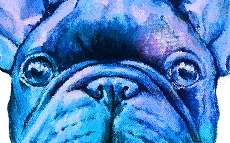
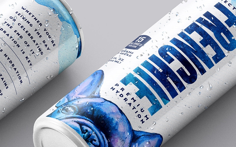
Now, the fun part. Tasked with creating a modern, sleek identity that would appeal to people of all genders, our team utilized the playfully curious head of a French Bulldog, coupling it with bold, impactful lettering. Allowing the brand to stand out and speak for itself, business card and can designs were kept simple with a clean white background. In order to provide a bit more context on the cans, each employs straightforward copy, meant to educate the consumer in as few words as possible and demonstrate that Frenchie is as unique a product on the inside as it looks from the outside.
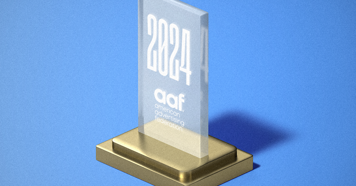
This careful approach has earned Frenchie both the attention of their target consumer and a bona fide spot on the shelves of retailers and cocktail bars—and a Gold ADDY award for Sales Promotion Campaign Packaging. Embarking on the next leg of the journey alongside their team, we’re excited about what we’ve accomplished together since 2017, and we’re even more thrilled about where Frenchie is about to go. So stay tuned and, more importantly, stay hydrated.
