Designing packaging that moves and speaks—even when it doesn’t – The Martin Group

Recently, 19 Crimes designed a series of interactive wine labels that came to life and told of their “crimes” when viewed through the brand’s smartphone app. While we don’t have access to sales data, if the number of people pointing their phones at end caps and aisle displays is any indication, they were wildly popular. People enjoy interacting with the products they buy. It can draw in new customers and build brand loyalty, two areas that have a direct impact on the bottom line.
But interactivity doesn’t require a smartphone—just smart design. Good product packaging can be interactive even if it never moves or speaks. Done well, it can move the consumer and speak to them in ways that compel them to buy.
A few months ago, our long-standing client, Three Brothers Wineries & Estates, decided it was time to readdress their Passion Feet line of wines. One of three award-winning brands that are part of the Three Brothers portfolio, Passion Feet is a line of blends and table wines that enjoy a loyal customer base that skews toward a female demographic. The old labels were quaint and playful, picturing women in a signature style—tall, fashionable, with really big feet. But the time had come for a brand refresh. Three Brothers wanted the labels to reflect both the wine and the women who drink it…and the Women of Distinction series was born.
Without an app and any digital magic, the labels that we created are good examples of interactivity of the old-fashioned variety. Our experience has taught us that packaging should interact with a consumer in three ways—from across the aisle, from three feet away, and when the product is in your hand. Passion Feet does all three.
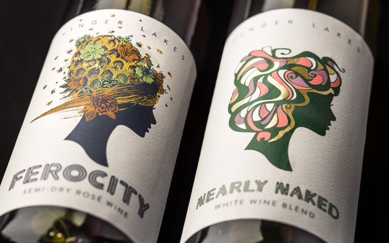
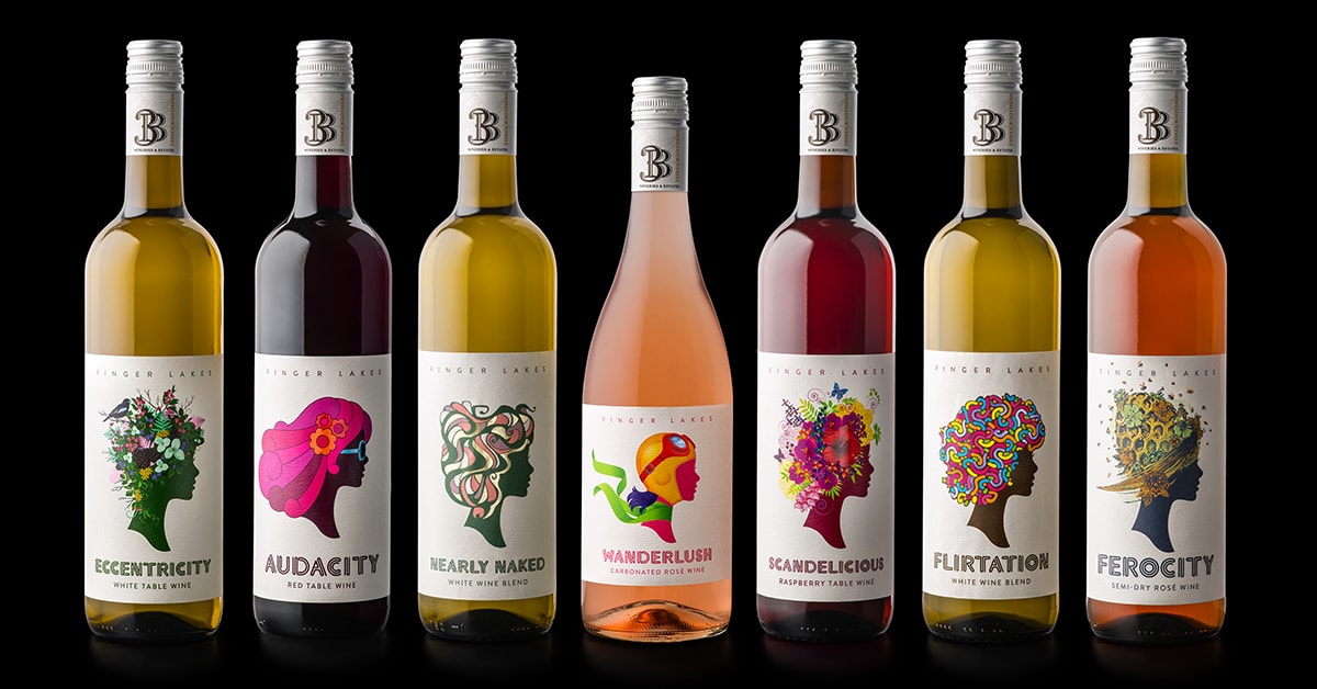
Each of the labels features a silhouette of a woman—intentionally faceless so it could be any woman or every woman. All in the same profile, they make a compelling series when standing side-by-side on the shelf. Clean design with a white background, the colorful women are different in what makes up their hair or head covering—and definitely worth a closer look.
At a closer level, you can see the detail of what makes each woman different. Working in tandem with the evocative names, the individual labels feature women with hair made from elements of nature, pop art, and adventure. By design, they compel you to pick them up and examine them more closely to see what defines Ferocity, Eccentricity, Audacity, and other traits of both wine and women.
Finally, when the consumer picks up the bottle in the store or as they pour a glass at home, the labels invite some interaction and time. Most will first notice the details of the printing that includes unique illustrations from artists in numerous countries, foils, embossing and debossing, and other techniques that are only appreciated at close inspection. On the back, there is also a short story that captures the spirit embodied in the name and the aspirations of many of the consumers who will drink it.
The series earned an ADDY award and a comment from the judges that said, “It’s sort of a reward to pick up a package that catches your eye and then you read it and say, ‘Oh, there’s even something interesting to read on it as well.’ So it delivers the full experience. It all works together. You can tell there was a brand voice that was evolved for this product.”
That experience invites women to speculate which label best captures their spirit and which wine will best suit their taste. The experience can also sow the seeds of brand loyalty. If a label can bring someone across the aisle to pick it up and then see themselves in it, it has made the buying decision less about price and more about emotion. And that is where every brand aspires to be.


